
This blog has remained more or less untouched for over two years. Sure, I updated the domain at one point, but other than that, it’s been more or less dormant. That all changes today, with the release of my new and improved website! Well, sort of new. There’s actually a mix of new and old elements to this revamped online presence. Let’s get into the new stuff first, and how it came to be.
The problem with the old site
My old solution was fairly simple: interactive content lives on python.raelynn.hattie.codes, everything else lives on this WordPress site. It’s simple, and it more or less met my needs of posting about the stuff I was making. However, using WordPress obviously means I’m stuck dealing with however WordPress wants to do stuff, and that led to certain compromises being made (such as the homepage just being a fairly basic WordPress page).
I’m a web developer though! Why am I constraining myself to the world of content management systems? Sure, WordPress works fine for a blog, but I wanted something that really felt like my own for my homepage. Plus, my personal branding everywhere else has evolved over the past year (such as the shift from orange and blue to purple and orange). So, I set off to build something completely from scratch. Something I could point to and say “I made that, and I’m happy with it”.
The design philosophy of the new homepage
Before I wrote a single line of code, I identified a few key design principals I wanted to stick to with this project:
- Performance through minimalism – the site must accomplish its goals with minimal resources. No heavy frameworks or similar solutions.
- Accessibility – the site must be reasonably accommodating to visitors with vision impairments or using various assistive technologies, and work on desktop, mobile, without JS or even CSS being needed to correctly view the site.
- Unique yet familiar design language – the site must have a visual identity distinct from existing styles such as Material or Fluent, yet remain similar enough to other modern designs to keep it feeling current and comfortable.
- Fully custom implementation – the site must be designed and implemented from the ground up by me, save for minor dependencies.
The performance and accessibility constraints eliminated frameworks such as React, at least in their default configurations. I could of course use something like SvelteKit with the static adapter, but that still felt overkill for my needs. After mulling over my options for a bit, I decided to go back to an old friend, a technology from an era before the likes of React ruled the net.
The foundations of the stack: Pug, 11ty, and Tailwind
Pug! A lovely little templating engine and language written in Javascript, dating back to the good old days of 2010, back when it was called Jade. I used to use Pug all the time, but then times moved on, and I found myself using it less. In simple terms, Pug lets you create functions and templates which compile down to Javascript functions, which in turn return fully static HTML. A Pug file looks something like this:
extends common/content-page

block page-name
    | Web Development

block intro
    p Dashboards. GIS tools. Static sites. I build web content that comes in all shapes and sizes.

block cards
    include common/projects/omnimap
    include common/projects/this-site
    include common/projects/dso-203
Here we’re telling Pug that we’re extending an existing template (common/content-page), and overriding 3 different sections (or blocks) of that template with custom content. We’re also using include to pull in other templates as inline content, allowing for easy mixing and matching of site elements (this gets much more powerful with mixins, which we will discuss in a bit).
To convert all this Pug code into ready-to-serve HTML, I’m using the excellent 11ty static site generator. 11ty not only works as a build tool, but also comes with a development server built on Browsersync. Having everything automatically update in my browser as I code is a must-have, in my opinion.
Now, while I could have used pure Pug and CSS (or some preprocessor language), I opted to also use Tailwind CSS, keeping all styling within the Pug source code instead of in a separate CSS file. This ended up saving me a ton of time as I tried different things out and expanded the site. For those who aren’t familiar, Tailwind essentially provides utility classes for every CSS parameter and value that your project could conceivably need, as well as a compiler which generates the bare minimum CSS for your particular needs.
For example, the following code in Pug gives me a div with a purple gradient, a drop shadow, fixed margins and dimensions, and rounded corners:
div(class="group bg-gradient-to-bl from-purple-700 to-purple-900 shadow-xl m-4 mb-1 z-0 w-24 h-10 rounded-lg")I know this looks awful if you’re not used to it, but trust me, this saves a ton of time as the project gets more complex.
Creating the initial mockup
Now that I had my tools ready, I could start building.
To start with, I put together a quick mockup with some sample text and stock photos.
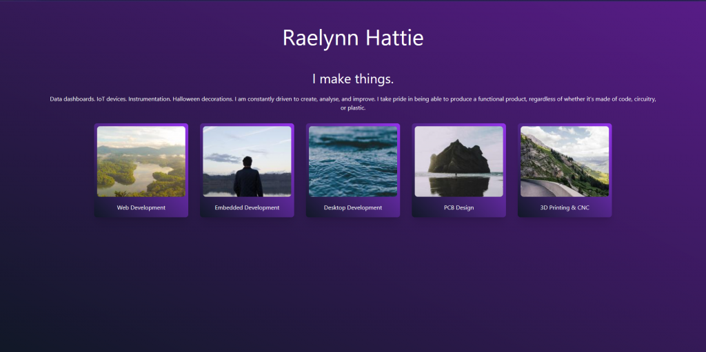
This mockup was primarily created to figure out the direction I wanted to take the aesthetics of the site, and I must say, I am still pretty happy with it as a first version. I decided on diagonal gradients, rounded corners, and cards as my main visual elements, making the site feel modern yet entirely distinct from the flat surfaces of most mainstream design languages.
Adding transitions
While not strictly necessary, transitions are still very useful to improve the feel of a site, providing a certain fluidity that the default blinking between pages just doesn’t give. Since this is a fully static site and I’m not using a framework, however, I needed an external library for transitions. I wanted something that was totally optional and would not impede non-JS users, and was also fairly lightweight. I chose Swup for this. It does what it needs to do, and gets out of the way.
To get it to transition the way I wanted, all it took was a few lines of CSS (in fact, the only CSS I wrote by hand on this entire project!)
.page-transition-slide {
    transition: opacity .075s, transform 0.1s;
    opacity: 1;
}

.is-animating .page-transition-slide {
    opacity: 0;
    transform: translate3d(0, 60px, 0);
}

.is-animating.is-leaving .page-transition-slide {
    opacity: 0;
    transform: translate3d(0, -60px, 0);
}

.is-animating.to-homepage .page-transition-slide {
    opacity: 0;
    transform: translate3d(0, -60px, 0);
}

.is-animating.is-leaving.to-homepage .page-transition-slide {
    opacity: 0;
    transform: translate3d(0, 60px, 0);
}
Helpfully, Swup provides classes for the destination page, allowing me to simply use .to-homepage to reverse the animation direction on the homepage. This gives the nice slide up on entering a section, slide down when going back symmetry to the animations.
Next steps
At this point, I had a main page laid out, some empty content pages, and a fancy animation flipping between them. In future articles, I will go over how I took this skeleton of a site and fleshed it out.